6 مشکل یا مسئله ای که برای رسیدن به یک کارت ویزیت ( business card ) منحصر بفرد، با آنها دست و پنجه نرم می کنید.
برداشت های اولیه، پایه ای را برای یک رابطه بالقوه با ارباب رجوع یا مشتری ایجاد میکند.
طبق آمار موسسه تحقیقات مغز، اکثریت مردم – دقیقا 72% – یک شرکت را براساس کیفیت کارت ویزیت آن قضاوت میکنند. همچنین اطلاعات حاکی از آن است که، 39% گفته اند با کسی که “کارت ویزیت ارزان قیمت (Cheap Looking)” دارد، کار نمیکنند.
برای ایجاد یک معارفه به یادماندنی و پایدار، به این ابزار بازاریابی (Marketing) ضروری نیاز دارید. جان بورخارت، متخصص بازریابی محتوا (Content Marketing Strategist)، می گوید که کارت ویزیت برای هر شغل شبکه ای بسیار مهم است:
“کارت به اندازه ی 3 ثانیه اول یک ویدئوی یوتیوب مهم است. این باید توجهات را به طرف خود جلب کند و نگه دارد. تعامل شبکه ای یک مسئله احساسی چند لایه است. شما هیچ فکری ندارید که کس دیگری به آن نیاز داشته باشد و گفتگوی تنیسی (مکالمه بین چند شخص) ممکن است به نظر خوب پیش برود اما بعدا میبینید، آنها منتظر چیز خاصی هستند…شما باید هر کاری که میتوانید انجام دهید تا مطمئن شوید که شما در این لحظه در یاد آنها میمانید.”
تاثیرات قوی شما ، میتواند شما را به سمت امکان فروش، مشارکت یا گام بعدی راهنمایی کند. شرکت ادوبی گزارش کرده که به ازای هر 2000 کارت ویزیت که شما منتشر میکنید، حدود 2.5% فروش افزایش میابد. همچنین روانشناسی کارتهای ویزیت، روی تغییر بالقوه که شما از آنها بدست می آورید تاثیر می گذارد. جزئیات کوچک میتواند تاثیر بزرگی داشته باشد، همانطور که طراح ارشد رسانه دیجیتال موسسه آپریتینگ، رومانو راموس میگوید:
“معرفی دیداری، اول به چشم می آید. همه چیز از چگونگی ارائه شما و مراحل آن به چشم انداز، نورپردازی و نحوه ی سایه انداختن ها بستگی دارد”
چه کارتهای ویزیتی چشمگیر (Stand Out) هستند؟
برخی از طرح های پیش بینی شده موسسه بیهنس برای سال 2019 ، هنوز روشهای خلاقانه و کاربردی را برای مشخص کردن و جلب توجه به سمت جزئیات برروی کارتهای ویزیت را پیشنهاد میدهند. به عنوان مثال، یک فونت بزرگ توجهات را به سمت اسم شما، شرکت و اطلاعات تماس شما جلب میکند. همچنین یک فونت پررنگ (Bold Font) نسبت به نوع کوچک آن در یک کارت ویزیت استاندارد یا مربعی، کامل کننده است. بعلاوه این اعتماد و تعهد را به بیننده منتقل میکند.
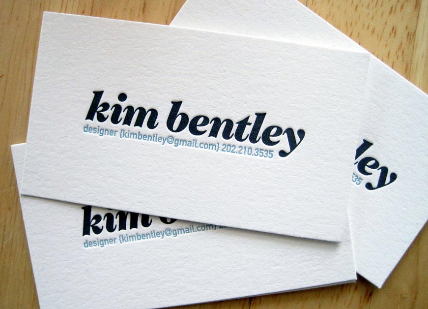
نام کیم بنتلی در نوع چاپ (فونت) بزرگ و پررنگ نوشته شده است.
همچنین رنگهای پررنگ، در روند بزرگترین طراحی های امسال استفاده بیشتری دارند.در پالت خود از رنگهای پررنگ تر استفاده کنید، که در مقابل رنگ سیاه و سفید معمولی یا ترکیب رنگهای اصلی (Primary Color) بیشتر چشمگیر خواهند بود.تصاویر بهترین تفسیر برای لوگوها و عناصر بصری دیگر هستند، چون آزادی انعطاف پذیری و رنگ بیشتری در چگونگی موضوعات خاص ارائه میدهند.
تصویر رنگی را اضافه کنید که محصول یا خدمات شما را به صورت هنرمندانه ارائه دهد.
نیکی اسپارتینز،طراح وبسایت یو ایکس نیویورک، سبک بروتالیست (Brutalism)، دست نوشته ها و دریافتها (احساسات) شخصی را کلید طراحی یک کارت ویزیت منحصر به فرد میداند:
“اگر واقعا میخواهید توجه درست افراد را جذب کنید، یک مقدار تفکر بیشتر، یک مقدار ریسک و شخصی سازی میتواند همیشه کمک کننده باشد.”
او تاکید میکند که تمام اینها را با هدف تقویت اطلاعات انجام دهید، نه اینکه با طراحی بیش از حد جزئیات را از بین ببرید.
“همیشه به یاد داشته باشید طراحیتان را به نام تجاری (برند) خود متصل کنید.”
حالا شما یک سری ایده برای طراحی کارت ویزیت بعدی خود دارید، بیاید روی چیزهایی تمرکز کنیم که باید از آنها دوری کرد.
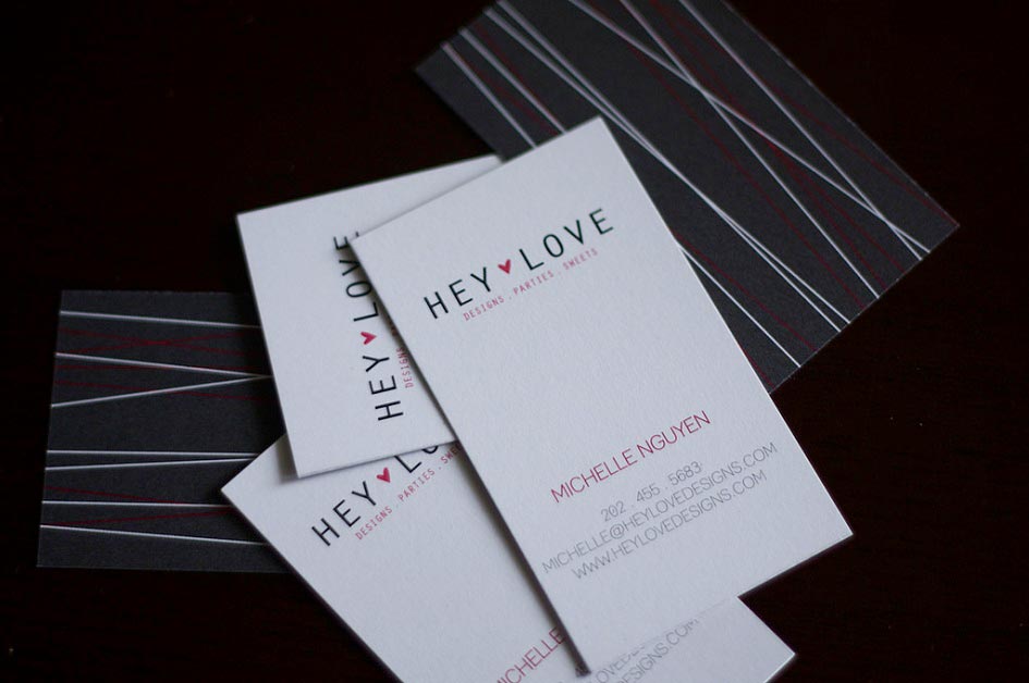
مسئله 1: انتخاب یک اندازه یا شکل معمولی
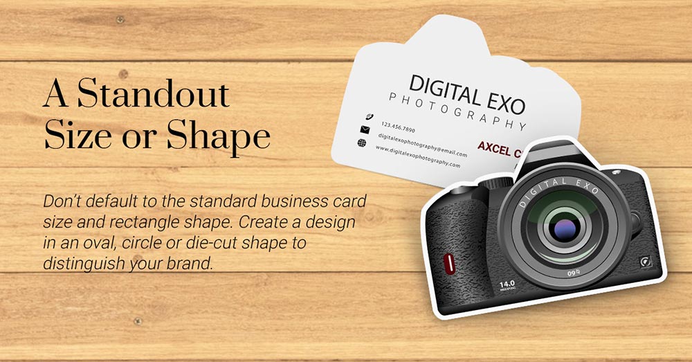
هر شخص دیگری مالک یک کارت مستطیل شکل با اندازه استاندارد است.یک کارت ویزیت گرد، بیضی یا برش خورده در ملاقات اول چشمگیر خواهد بود و در همین لحظه نگاه اجمالی ارباب رجوع شما به آن خواهد بود.شکلی را انتخاب کنید که هم تراز نام تجاری (Brand) شما باشد یا ماهیت کسب و کار شما را منعکس کند.
خوانایی و هویت نام تجاری خود را به خاطر به وجود آودرن کارت ویزیتی با شکل منحصر به فرد به خطر نیندازید.شکل باید کامل کننده باشد یا با محصول یا سرویسی که شما ارائه میدهید مرتبط باشد.
مسئله 2:شما طرحی را به وجود آوردید که خیلی شلوغ است.
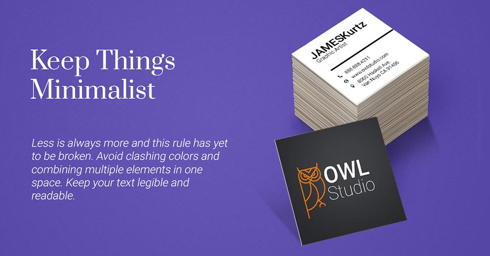
کمتر حرف بزن بیشتر عمل کن (Less is always more) و این قانون هنوزهم شکسته میشود. کم گویی (Minimalism) از اواخر دهه 1960 به وجود آمده و تا اوایل 1970 ادامه داشته است. و ما امروزه همچنان این رو در روابط کاربری وبسایتها ملاحظه میکنیم، نام های تجاری زیبایی مثل گلسیر(Golssier) و دیگر بنگاه های تجاری معاصر. برای تمرین گزیده گویی، از تداخل شدید رنگها و عناصر چندگانه که برای جلب توجه افراد با هم مبارزه میکنند، پرهیز کنید.رنگهای بیش از حد برای دید چشم راحت نیست پس به یک یا دو رنگ بسنده کنید.مشکی به عنوان یک رنگ غالب یک فرم کلاسیک است که به عنوان بخشی از الگوی الهام بخش گزیده (inspired) گویی امروز، ادامه پیدا کرده است.
این طراحی گزیده گویی حداکثر فضا را سفید نگه میدارد و چشم را به سوی اطلاعات تماسی مهم سوق میدهد.
فقط مهمترین اطلاعات را روی کارت ویزیت خود قرار دهید.عناصر اصلی برند مثل لوگو (Logo)، نام شرکت یا شعار (Tagline) خود را قرار دهید.شماره، ایمیل و صفحات اجتماعی خود را که بیشتراستفاده میکنید، مشخص کنید.قرار دادن بیش از یک شماره یا صفحه اجتماعی میتواند گیرنده شما را گمراه کند و بدنبال راهی برای برقرای ارتباط مستقیم باشد.
برنگر توضیح میدهد: “مهم است که فقط اصلی ترین اطلاعات را قرار دهید. متن بیش از حد میتواند گیرنده (کارت ویزیت) را منحرف کند.” او اضافه میکند که هنوز هم “همه عناصر ضروری طراحی باید جریان داشته باشد و از حذف جزئیات لازم پرهیز کرد.”
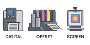
مسئله 3:شما از مواد معمولی و ویژگی های چاپ استفاده میکنید.
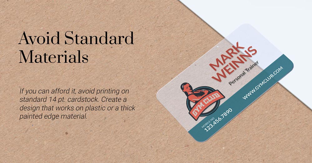
به مجموعه کارت ویزیت های دریافتی خود سری بزنید. چند تا از آنها پس زمینه غالب سفید یا ترکیب یک سطح ساده استاندارد و یک رنگ اصلی است؟ در یک لحظه، در نگاه اول تمام این کارتها با وجود تفاوت در فونت و ترکیبهای رنگی، شبیه به نظر میرسند.
فرض کنید که قانون را نادیده گرفته و به سراغ یک کارت ویزیت پلاستیکی بروید.
در مقایسه با کاغذ یا مقوا، پلاستیک میتواند شفاف (see-through) یا مات (frosted) باشد. به واسطه موادش چشمگیر است و یک جایگزین مدرن و براق برای کارت های ویزیت معمولی ارائه میدهد. همچنین مقاوم دربرابر آب و پارگی است-ماندگاری که با مواد سست تر نمیتوان به آن دست یافت.
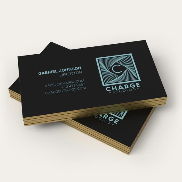
آیا مقدار اضافی رنگ میخواهید؟
رنگ کارت ویزیت که رنگی خیره کننده باشد، به طوری که هر کس در یک نگاه بتواند آن را ببیند، به ویژه زمانی که در نواری ضخیم قرار میگیرد.با ضخامتی در حدود 32 نقطه. مقوا های مخصوص کارت ویزیت (cardstock) که نور رنگهایی مثل نارنجی یا رنگهای متالیک با ظاهری شیک، در آنها بیشتر است.
مسئله 4:شما کارت ویزیتی را چاپ کردید که در آن از مواد بی دوام و نازک استفاده شده است.
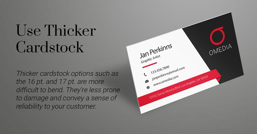
شرکتهایی که به نگاهی کلاسیک درمورد کارت ویزیت خود نیاز دارند معمولا کارتی با ضخامت استاندارد 14 نقطه را انتخاب میکنند. اما این همچنین انتخاب بسیاری از شرکتها برای رسیدن به یک دید حرفه ای است.با انتخاب مقواهای ضخیم تر مثل 16 و 17 نقطه، خم شدن دشوارتر است و بنابراین کمتر آسیب میبینند. جدا از دوام بیشتر، هر دو گزینه به طور قابل توجهی احساس ضخیم بودن در دست دارند.لمس این ضخامت احساس قابلیت اطمینان را بیشتر میکند و احساس به یاد ماندنی تری نسبت به نوع نازک آن دارد.
مسئله 5: شما از هر دو طرف کارت استفاده نکرده اید.
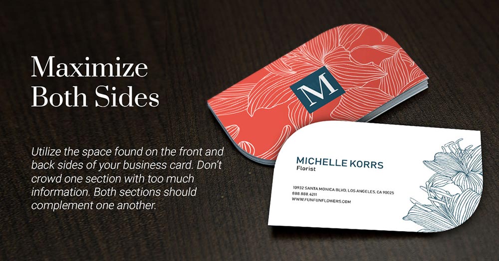
وسوسه برانگیز است که یک الگو را دنبال کنید و به سادگی لوگو و نام شرکت را در جلوی آن قرار دهید سپس جزئیات تماس را در پشت آن بنویسید. اما چه میشود اگر شما کمی این فرمول طراحی را تغییر دهید و روشی را برای استفاده حداکثری از دو طرف پیدا کنید؟
اگر شما قصد دارید از یک قاب کوچکتر مثل مربع استفاده کنید، به یاد داشته باشید که همه عناصر در طرف جلو و پشت، باید تاثیر قابل توجهی داشته باشند. وقتی به هر طرف نگاه میکنید آنها باید به طور پیوسته به عنوان کامل کننده در سمت خودشان کار کنند. عکس یا تصویری اضافه کنید که به مشتریان کمک کند تا خدمات شما را در مقابل خود تصور کنند.از تصاویر و فونت های جالب برای نشان دادن اطلاعات تماس استفاده کنید. گزیده گویی با استفاده از رنگهای مکمل (Complementary Colors) نیز در هر طرف روی کارت های ویزیت مربعی منحصربفرد، کاربردی است.
مسئله 6: طراحی را به عنوان یک کارت ویزیت محدود میکنید.
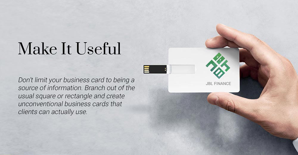
تخیل شما تنها محدودیتی است برای اینکه تا چه حد میتوانید طرح کلی کارت ویزیت را بپذیرید. شکل مریع یا مستطیل معمولی را گسترش دهید و کارت ویزیتی به وجود آورید که مشتریان بتوانند از آن استفاده کنند. شرکتهای تکنولوژی میتوانند از یک یو اس بی استفاده کنند در حالی که معماران ممکن است از کولیس (Caliper) استفاده کنند، دستگاه کوچکی که غالبا برای اندازه گیری استفاده میشود.برای ایجاد ارتباط درهنگام استفاده از کارت، اطمینان حاصل کنید که فرم مستقیما با محصول یا خدمات شما برای مشتریان در ارتباط است. برای جزئیات بیشتر، شما میتوانید راهنمایی گام به گام ما برای چگونگی ایجاد کارت ویزیت منحصربفرد را بررسی کنید.
کمک به خلق طرح های بهتر
تمام صفحات محصول ما شامل الگوی طرح های قابل دانلود است که نشان میدهد تمام عناصر ضروری طراحی باید کجا قرار بگیرند. اگر شما به طرح های الهام بخش بیشتری نیاز داشتید، در اینجا 25 طرح خیره کننده برای الهام بخشی به خلاقیت شما وجود دارد.
با زمان کافی، برنامه ریزی، مشورت و تجدید نظر،شما بهترین کارت ویزیت های منحصر بفرد را ارائه خواهید داد.
چگونه یک کارت ویزیت خلاقانه به وجود آوریم؟
میخواهید ایده منحصربفرد خود را به واقعیت تبدیل کنید؟ برخی از گزینه های هدیه ما شامل کارت ویزیت فویل و چاپ فلزی را بررسی کنید.
ما برای جنس های جایگزین، پلاستیک، لبه های رنگی و کارت ویزیت های مغناطیسی را پیشنهاد میکنیم.
آیا پیشنهادی در مورد چگونگی خلق یک کارت ویزیت منحصربفرد دارید؟ نظر خود را در زیر وارد کنید و به ما اطلاع دهید.
لینک منبع : 6 Problems That Get in the Way of a Unique Business Card ترجمه شده توسط چاپ روشا